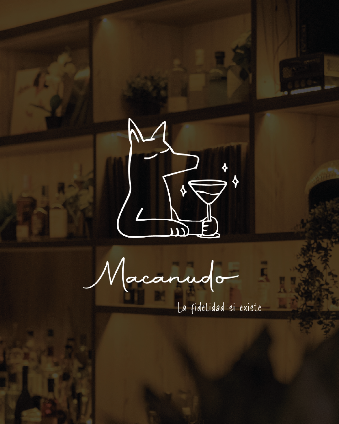
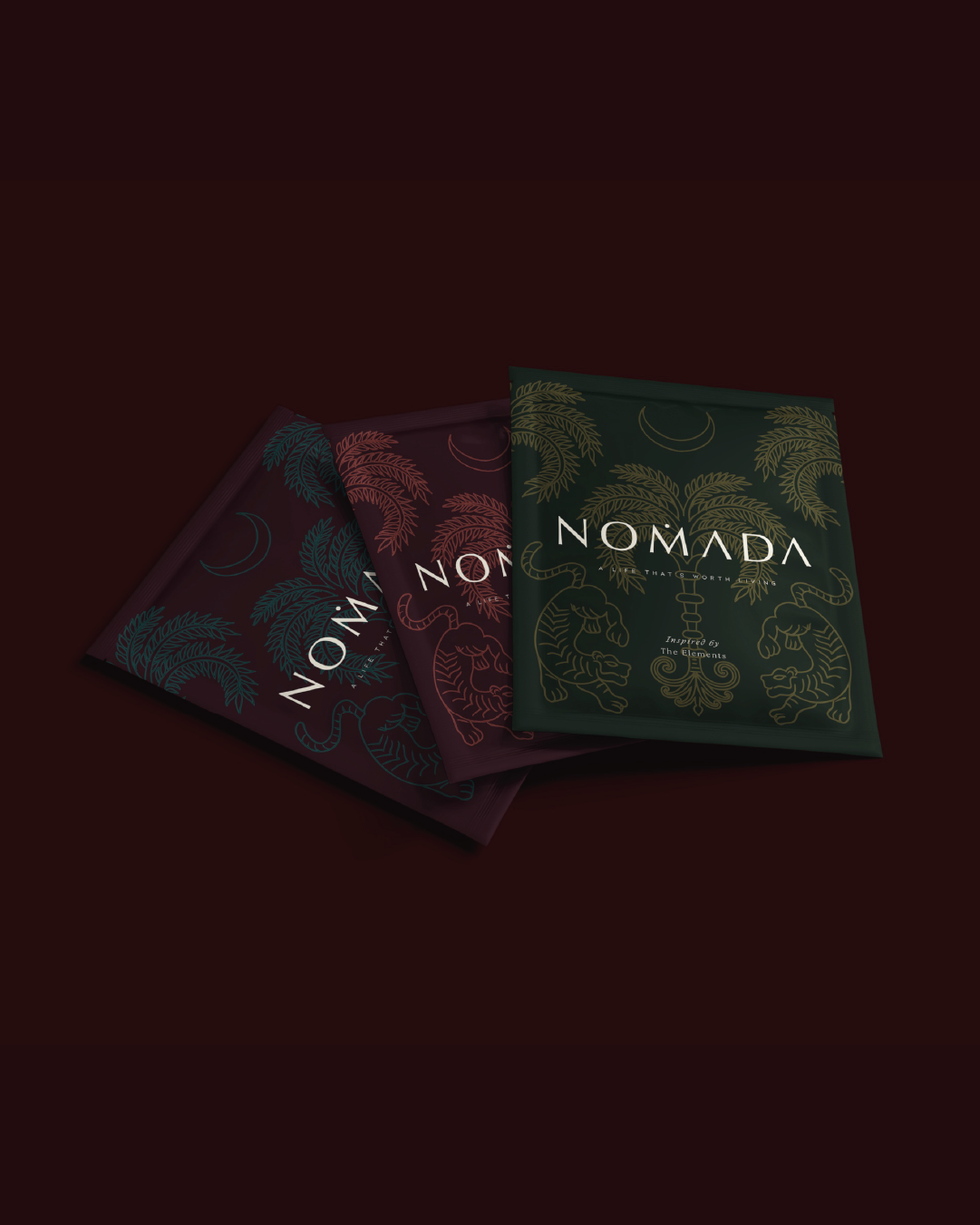
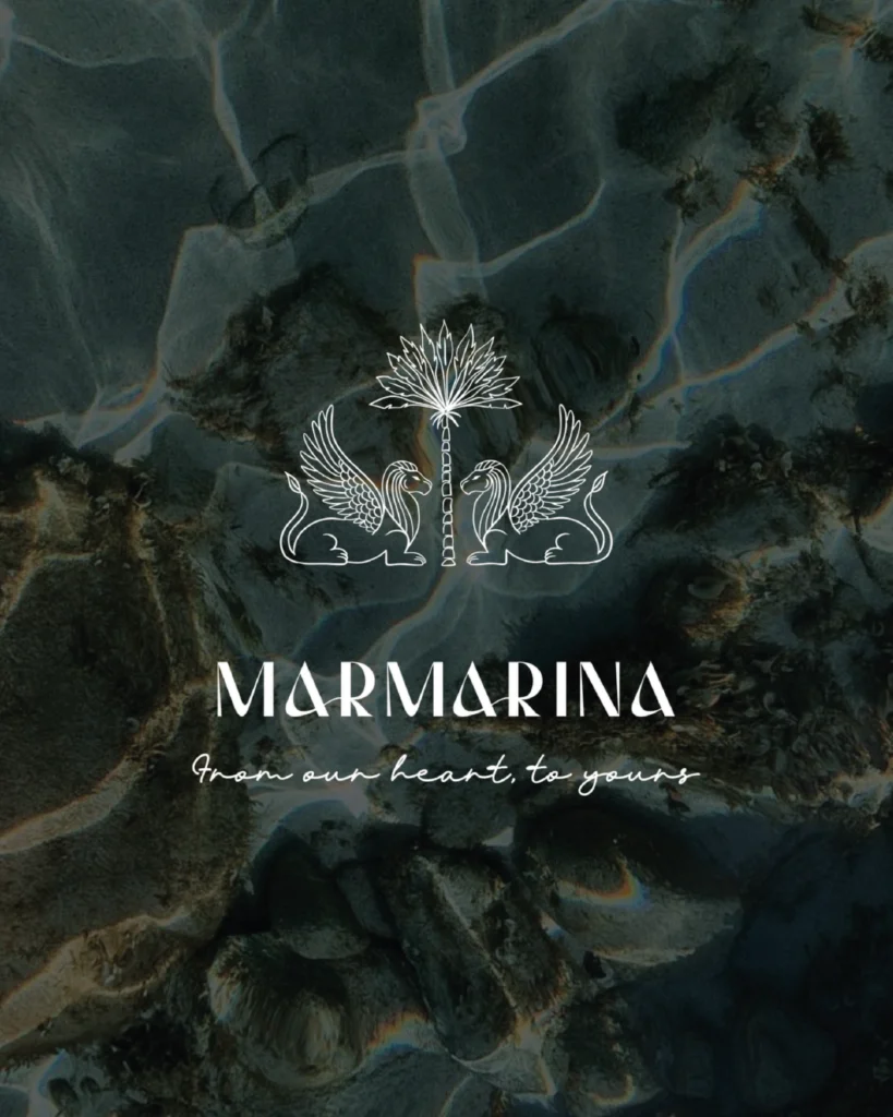
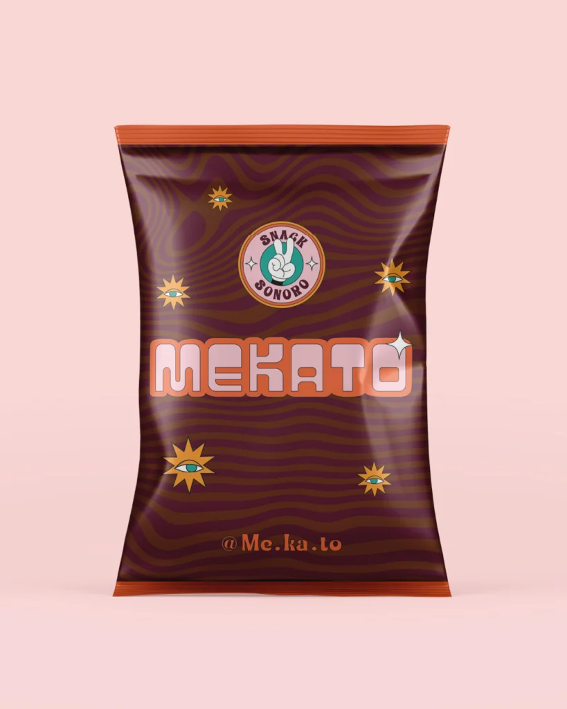
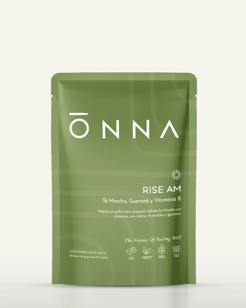
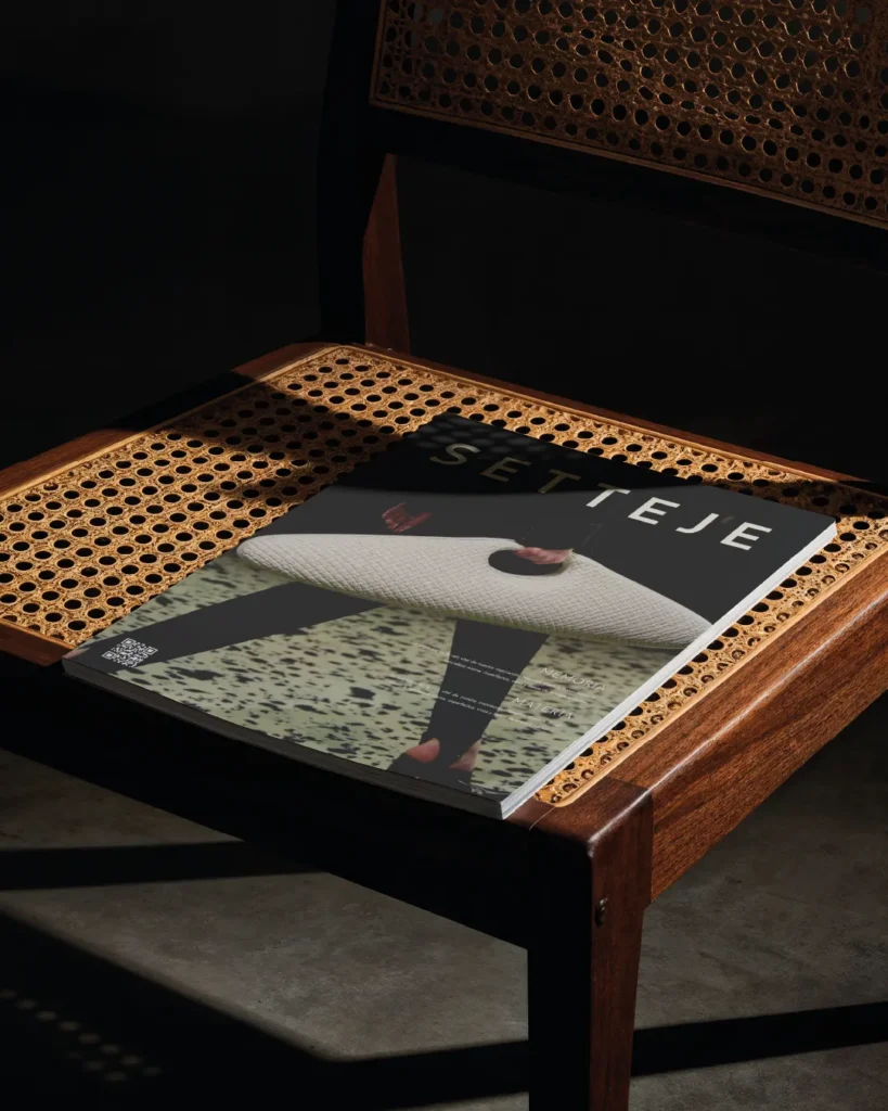
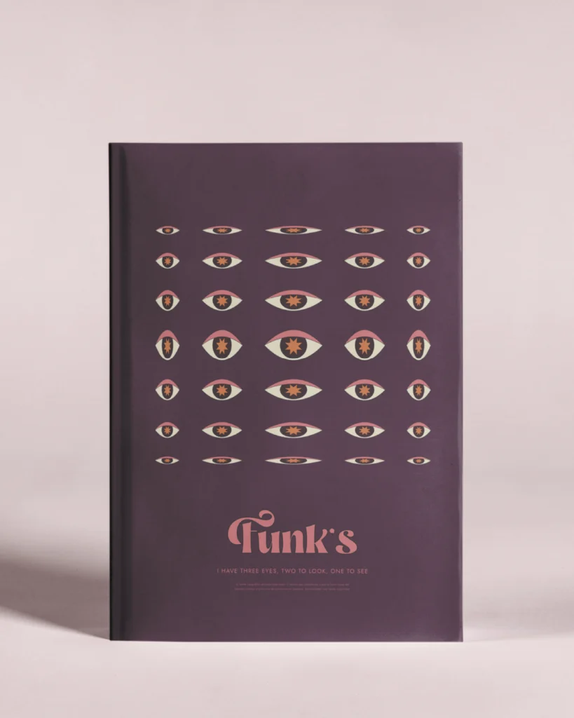
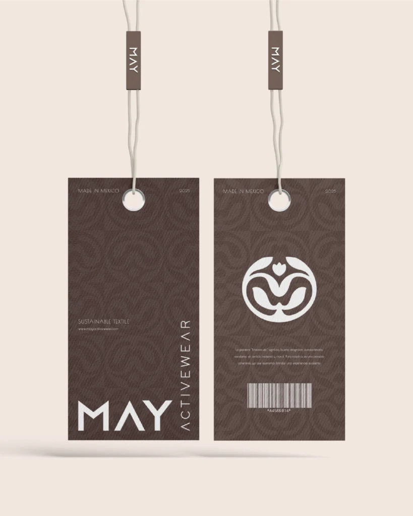
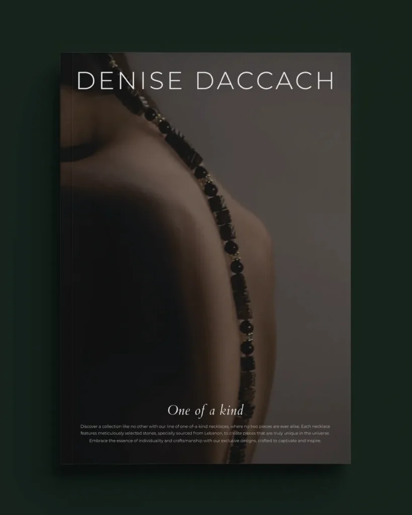
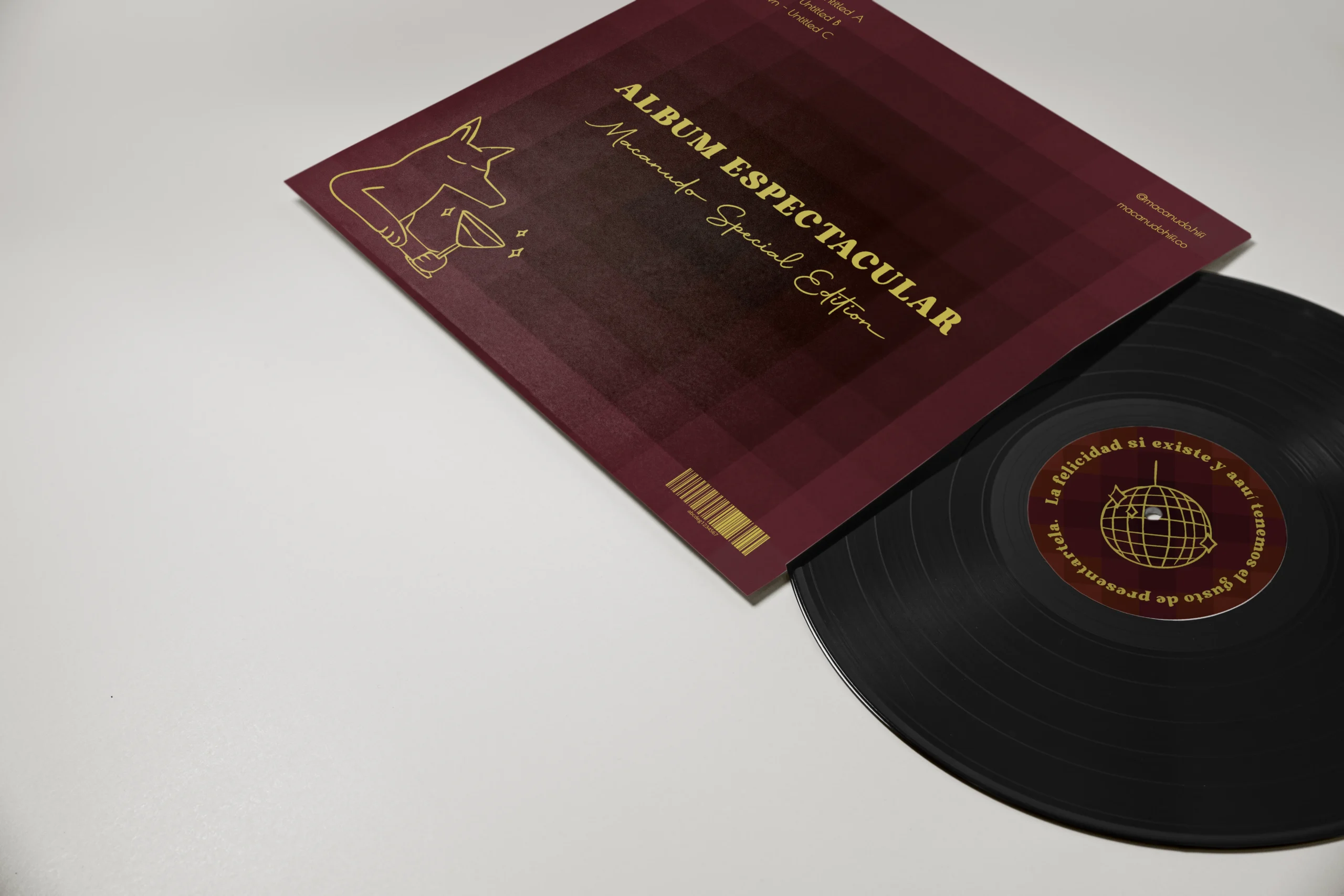
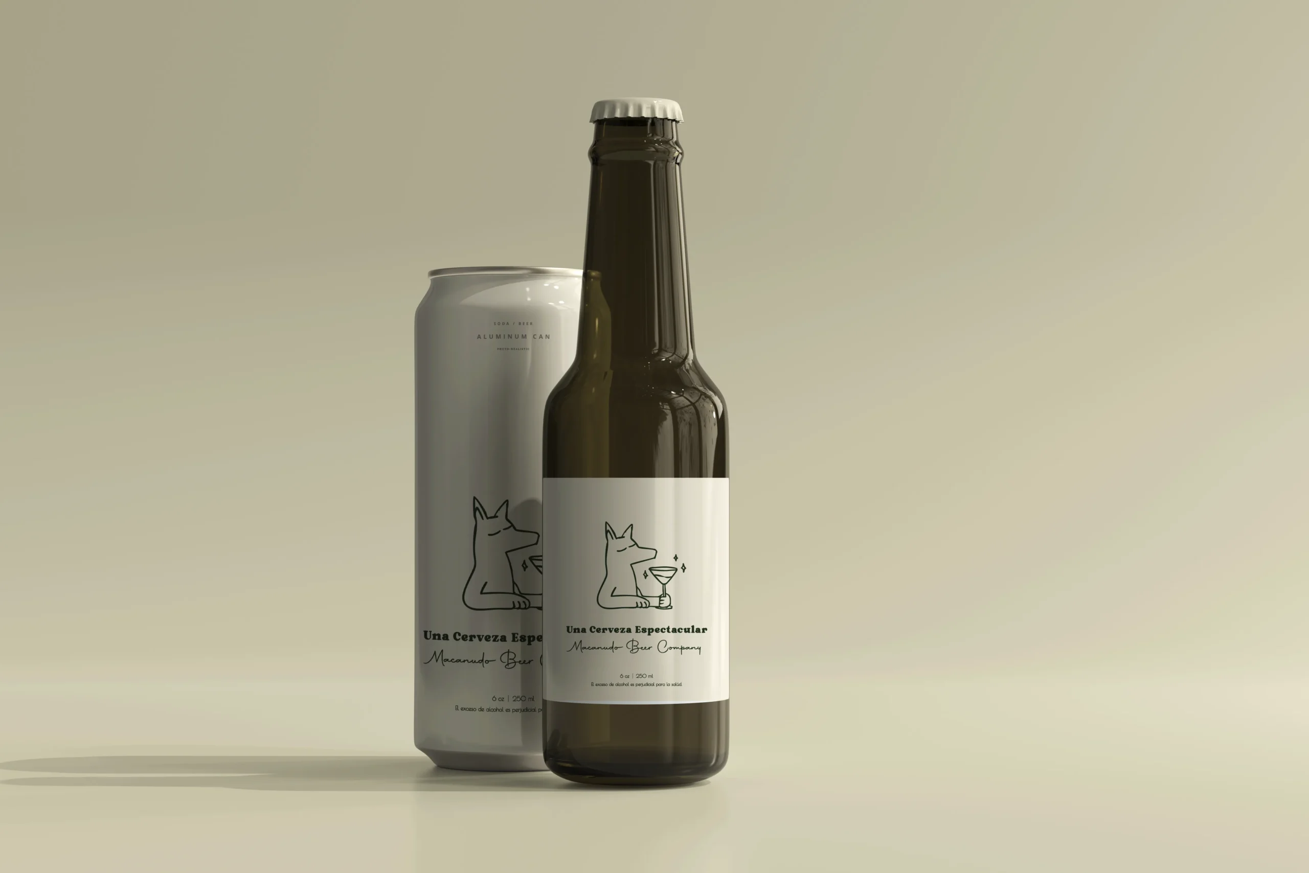
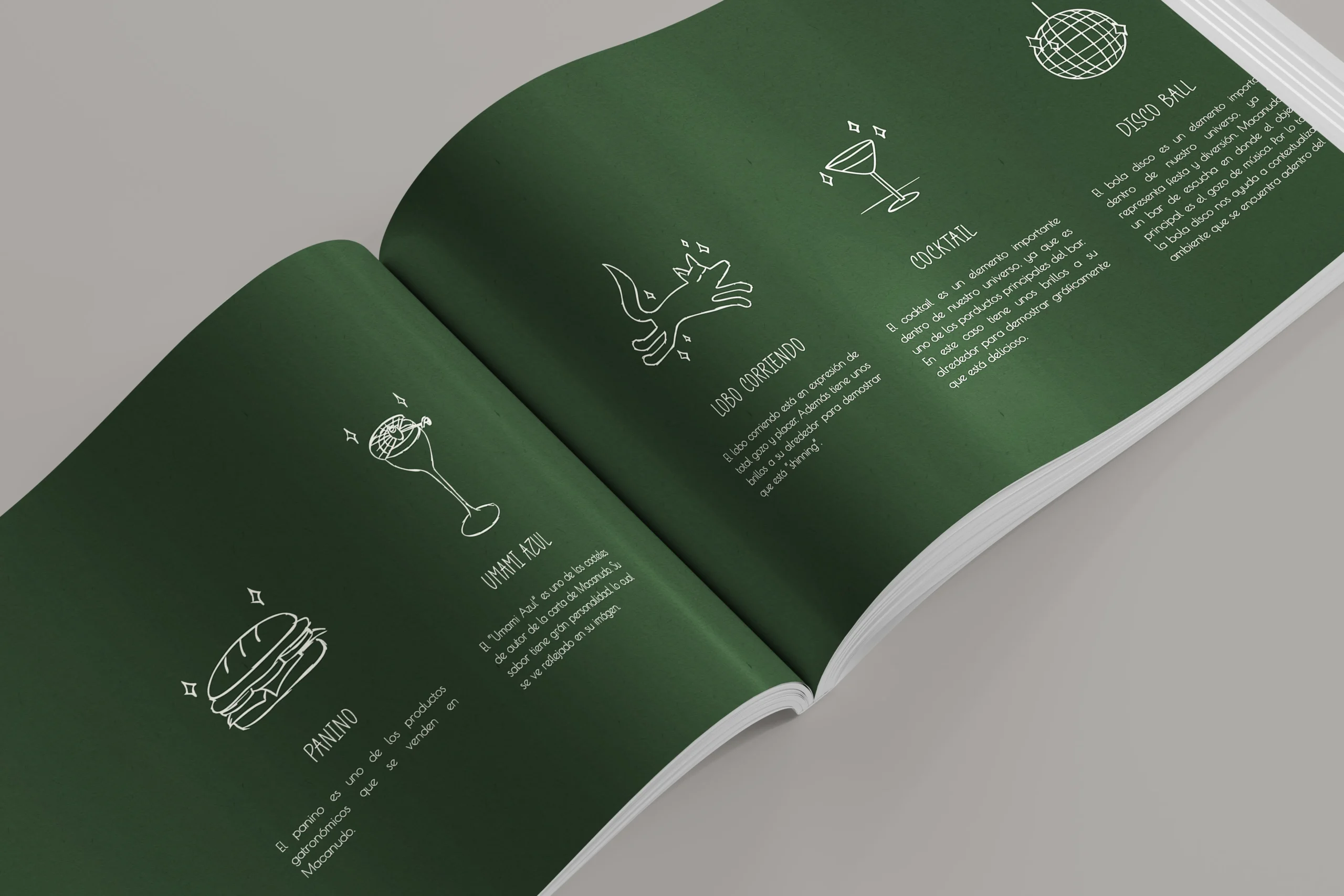
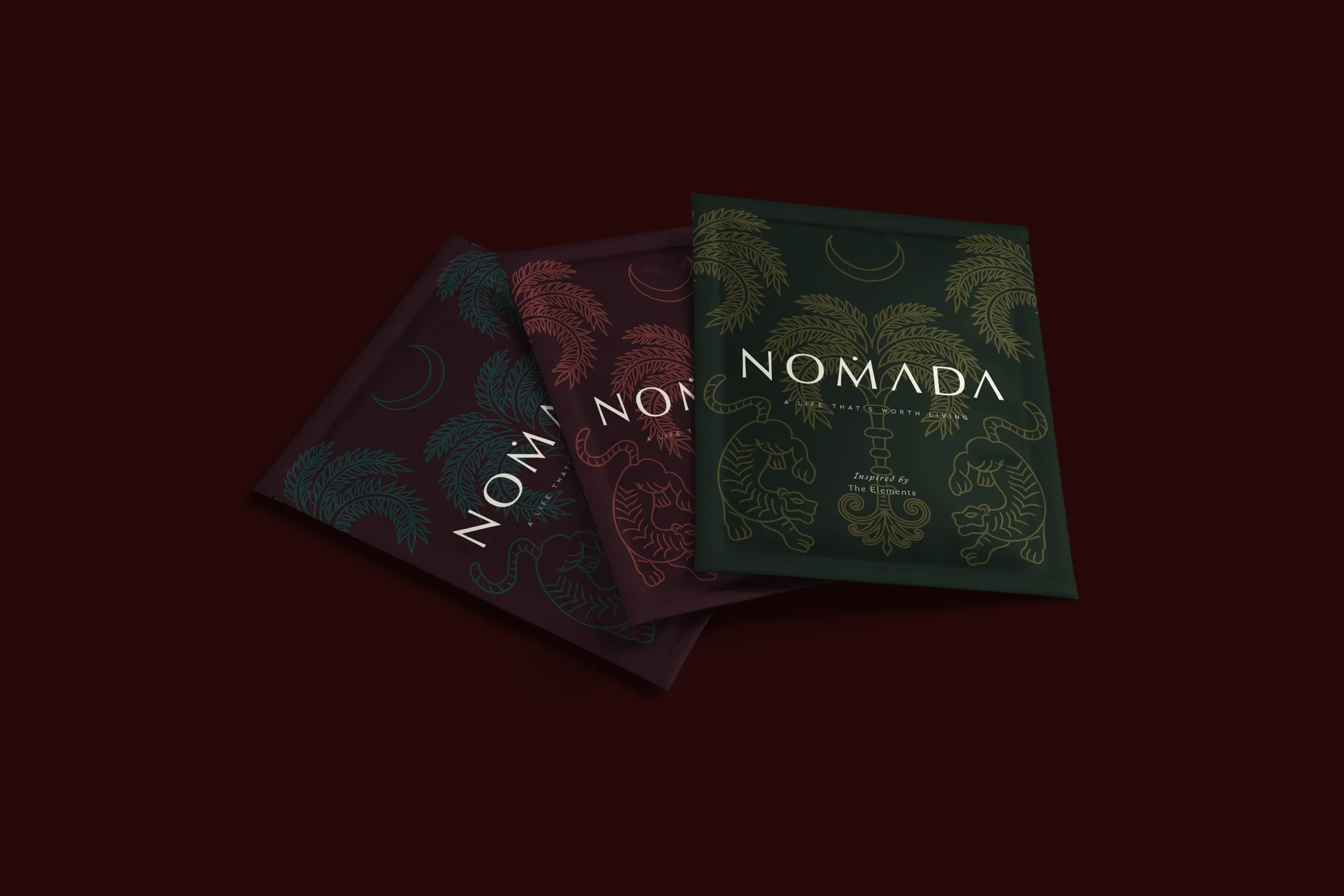
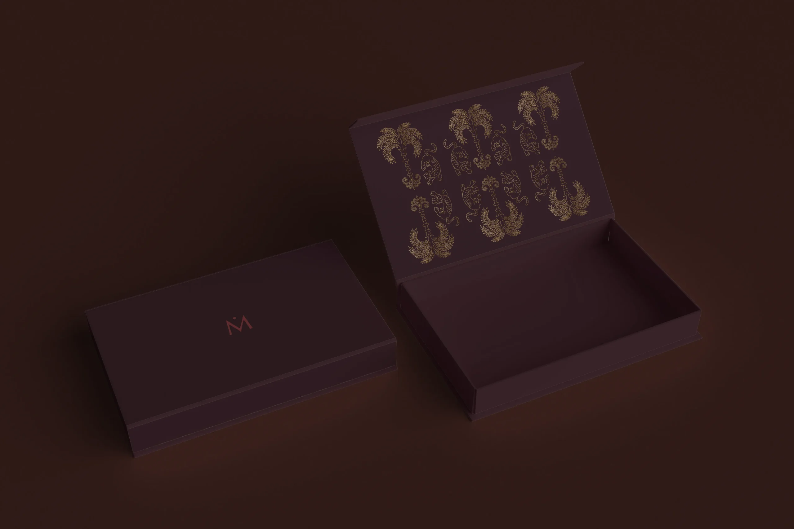
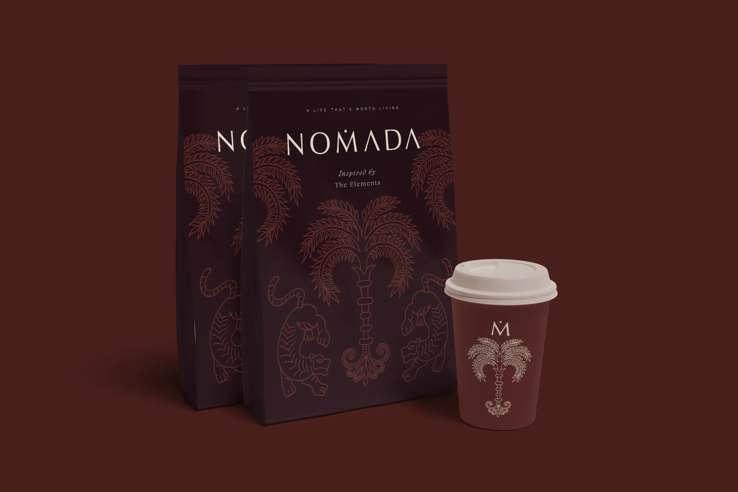
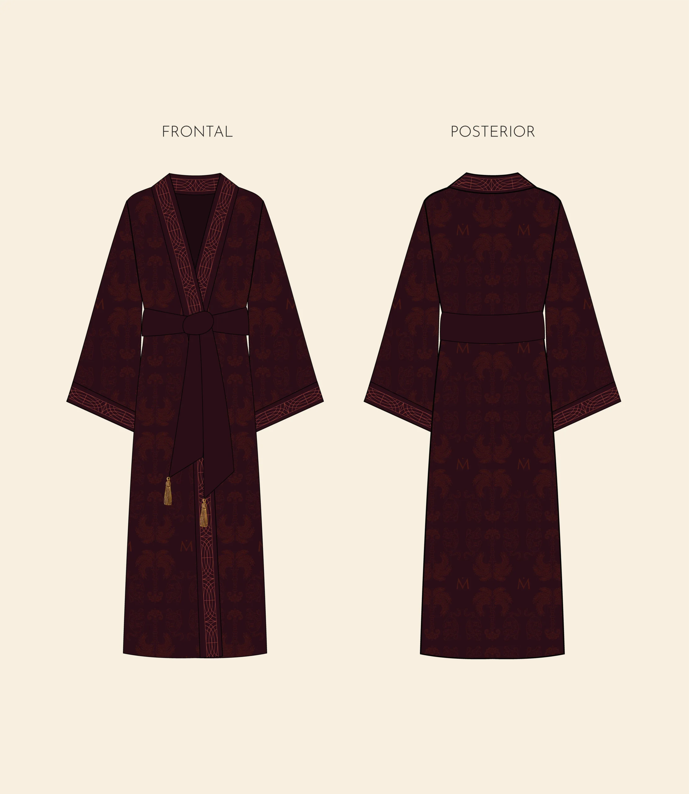
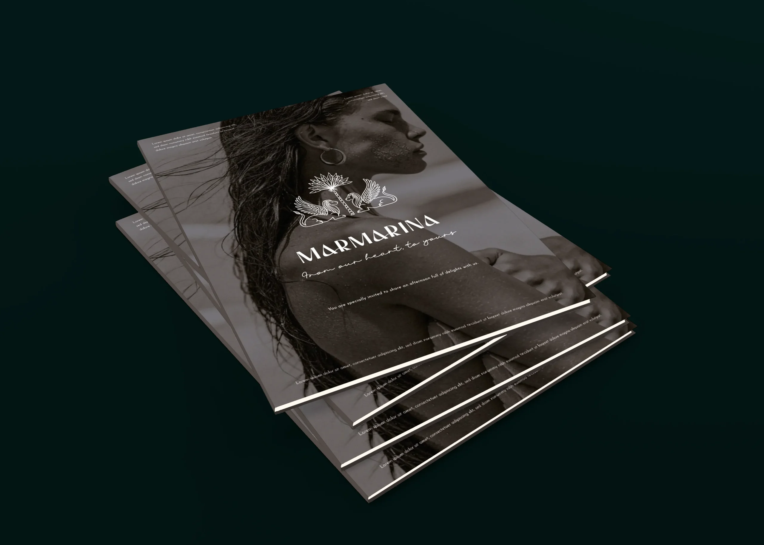
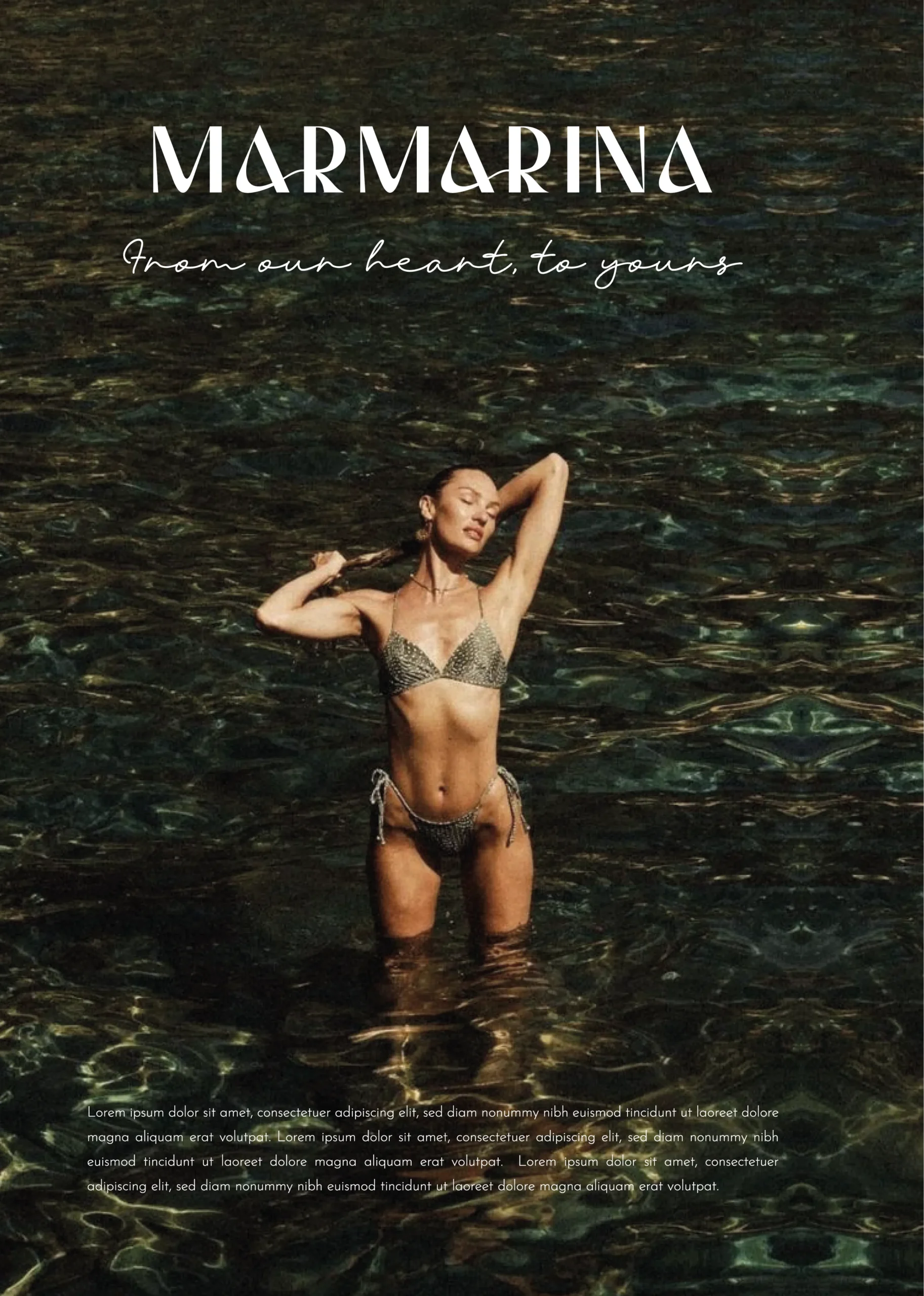
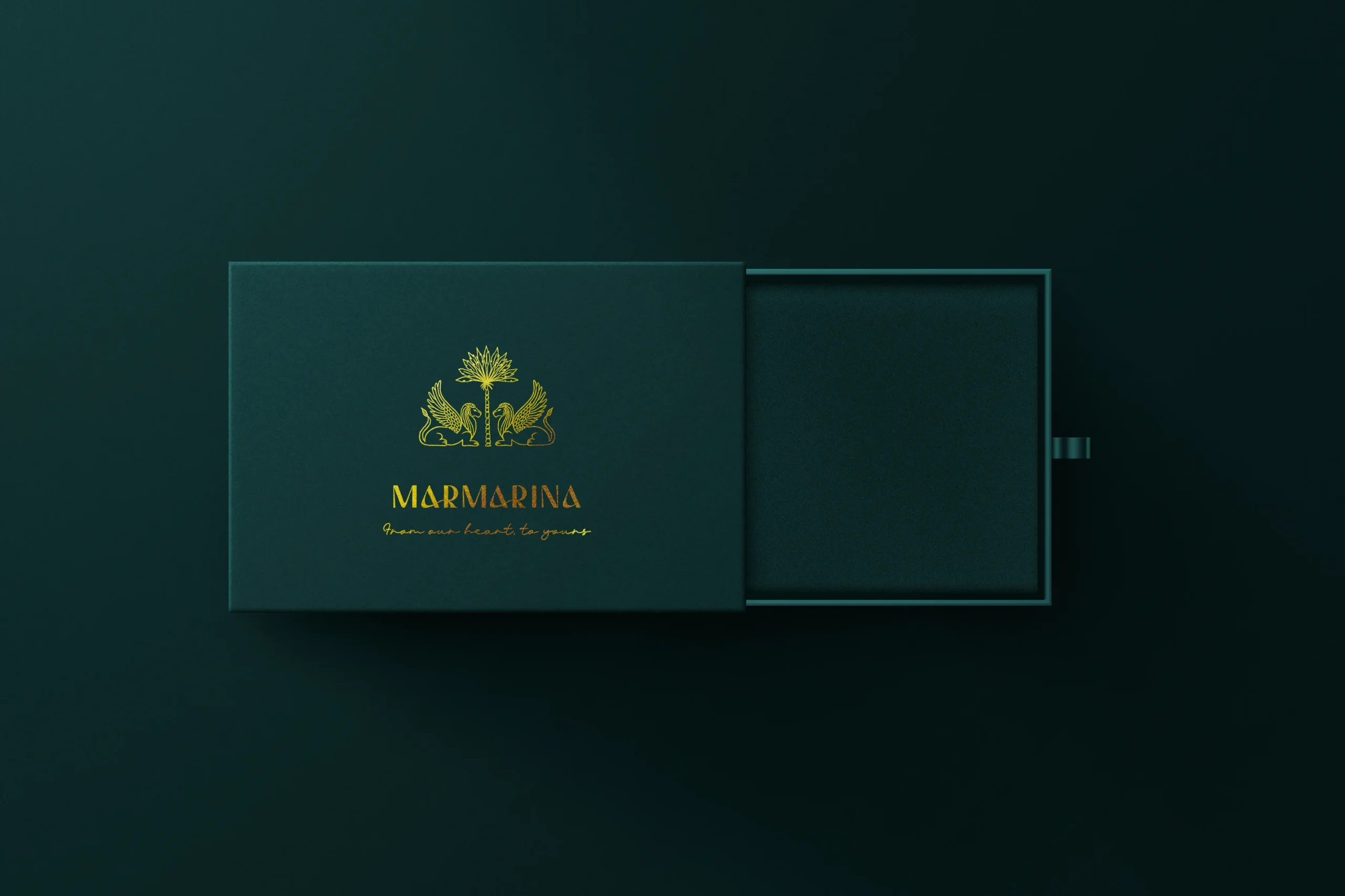
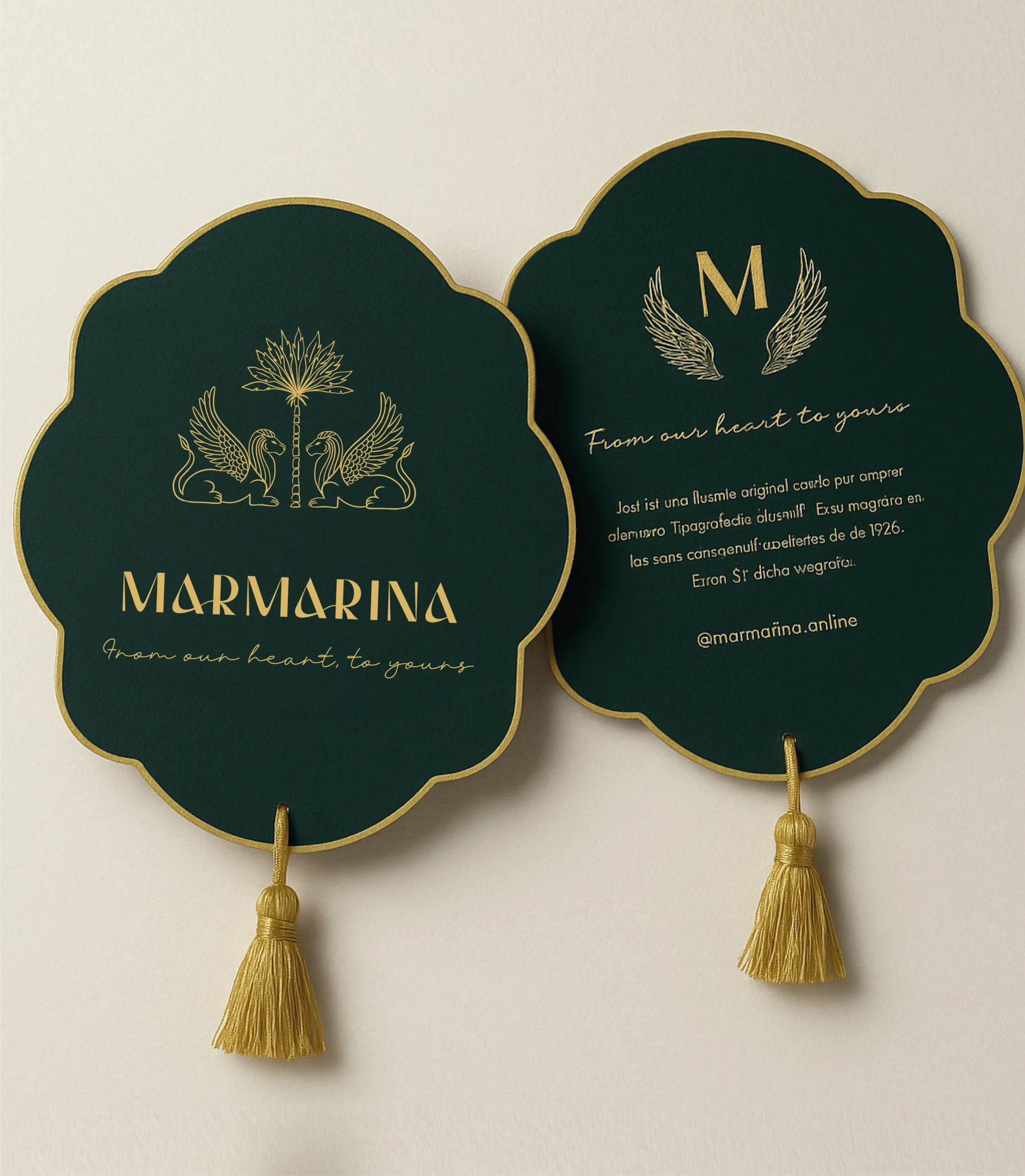
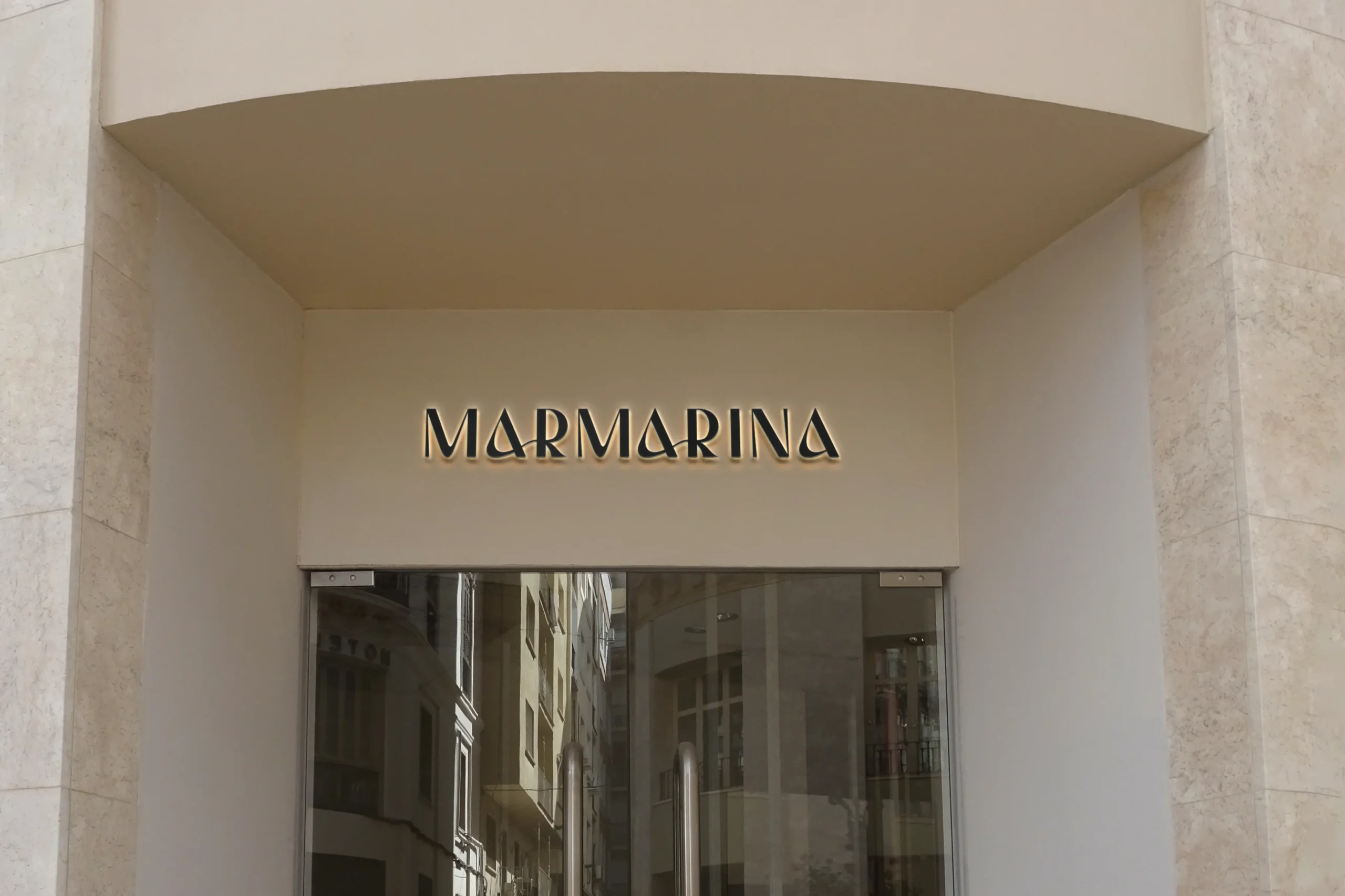
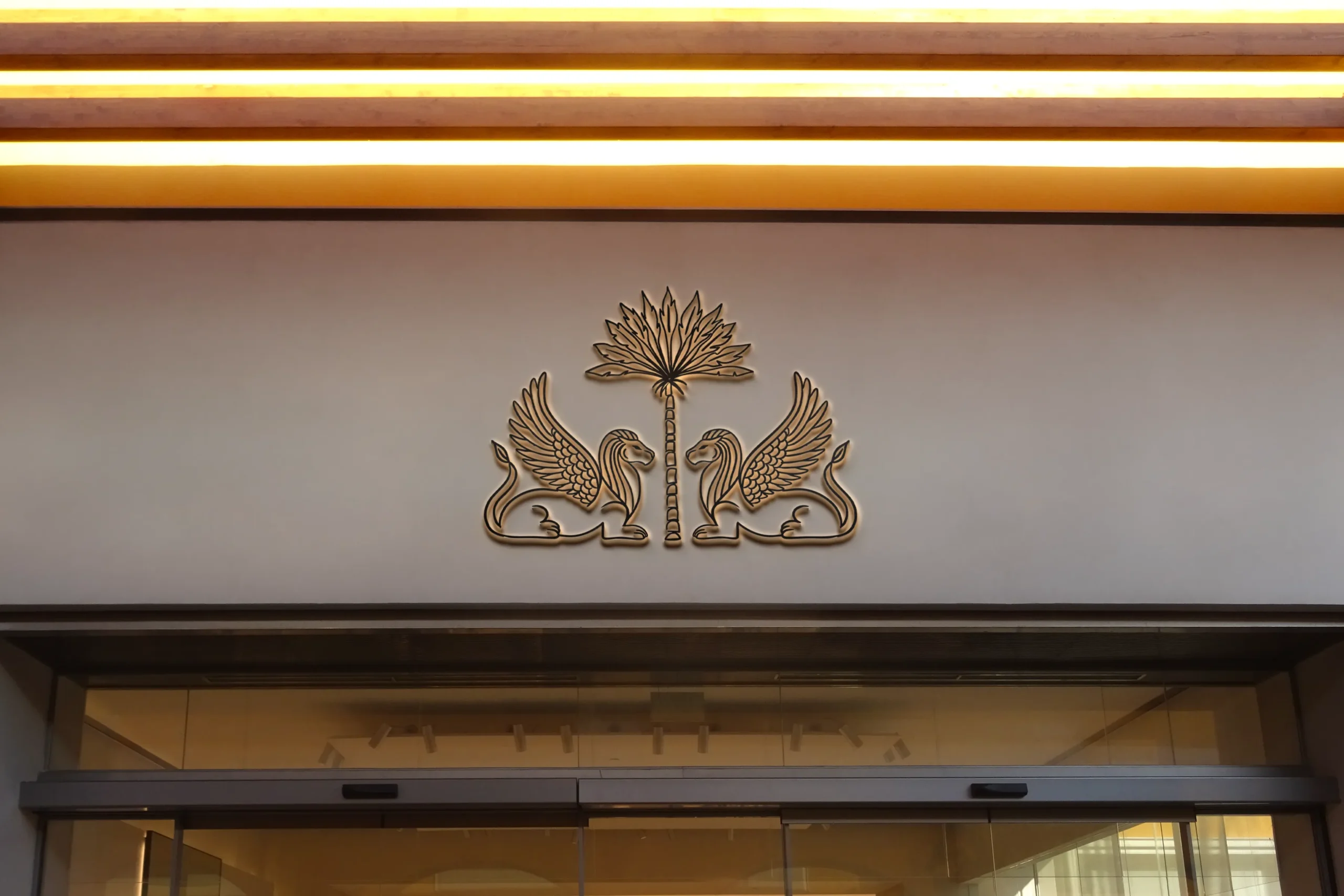
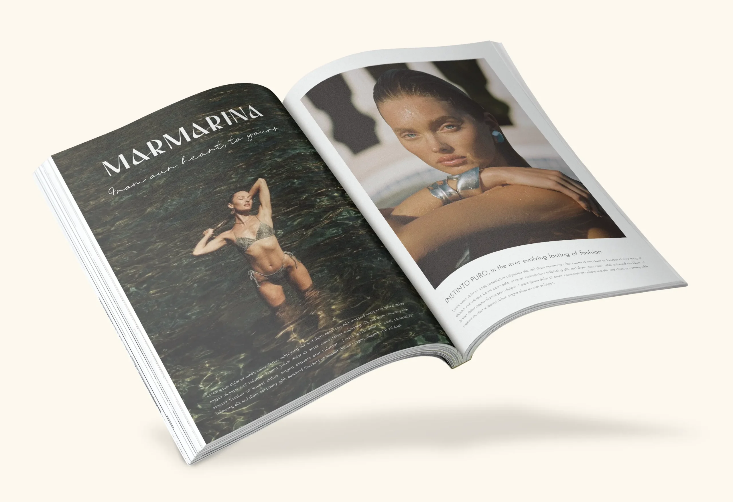
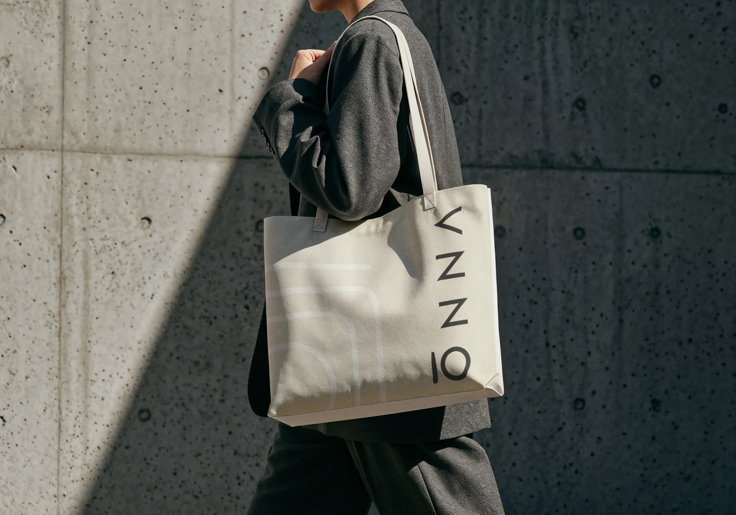
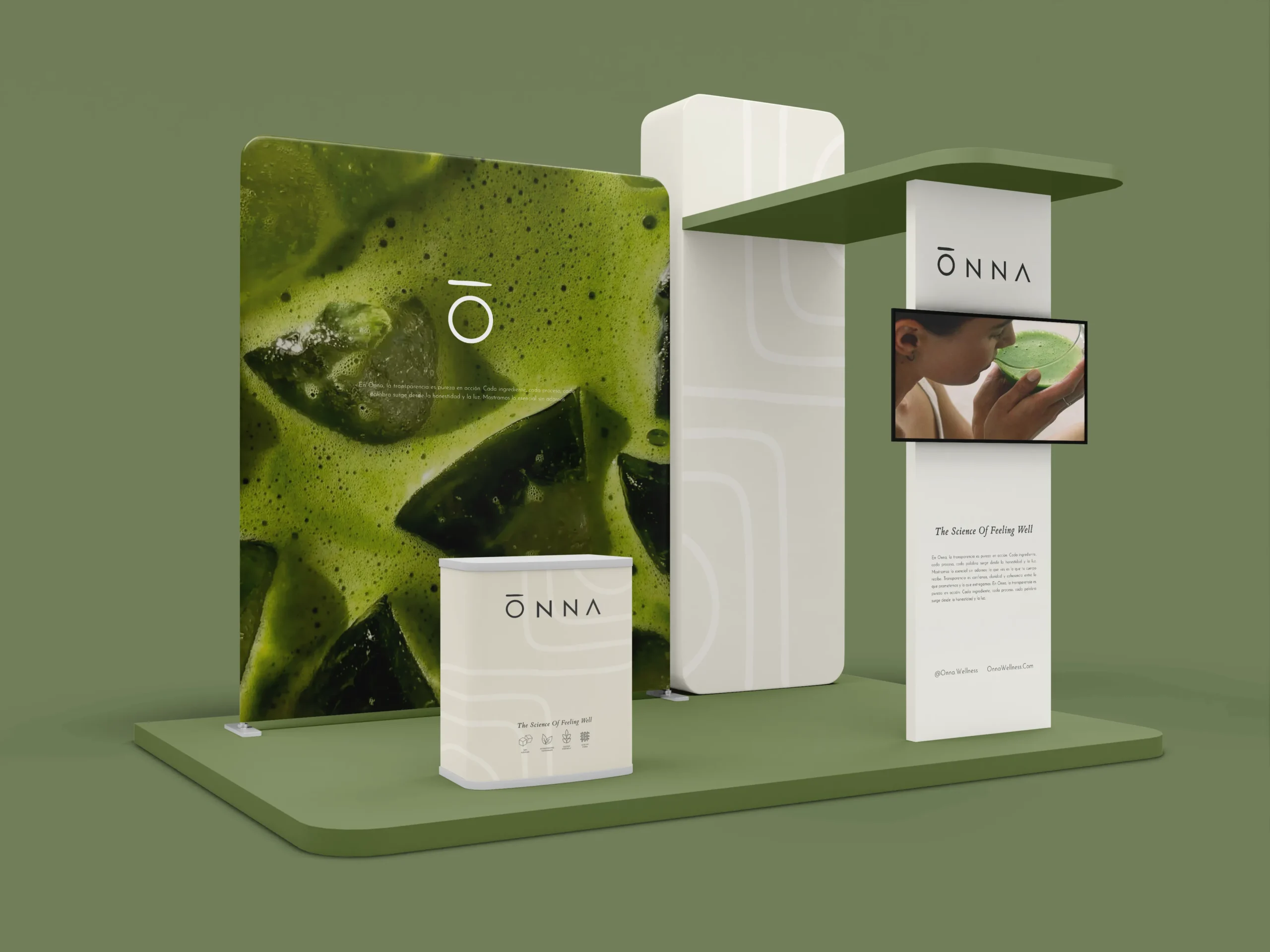
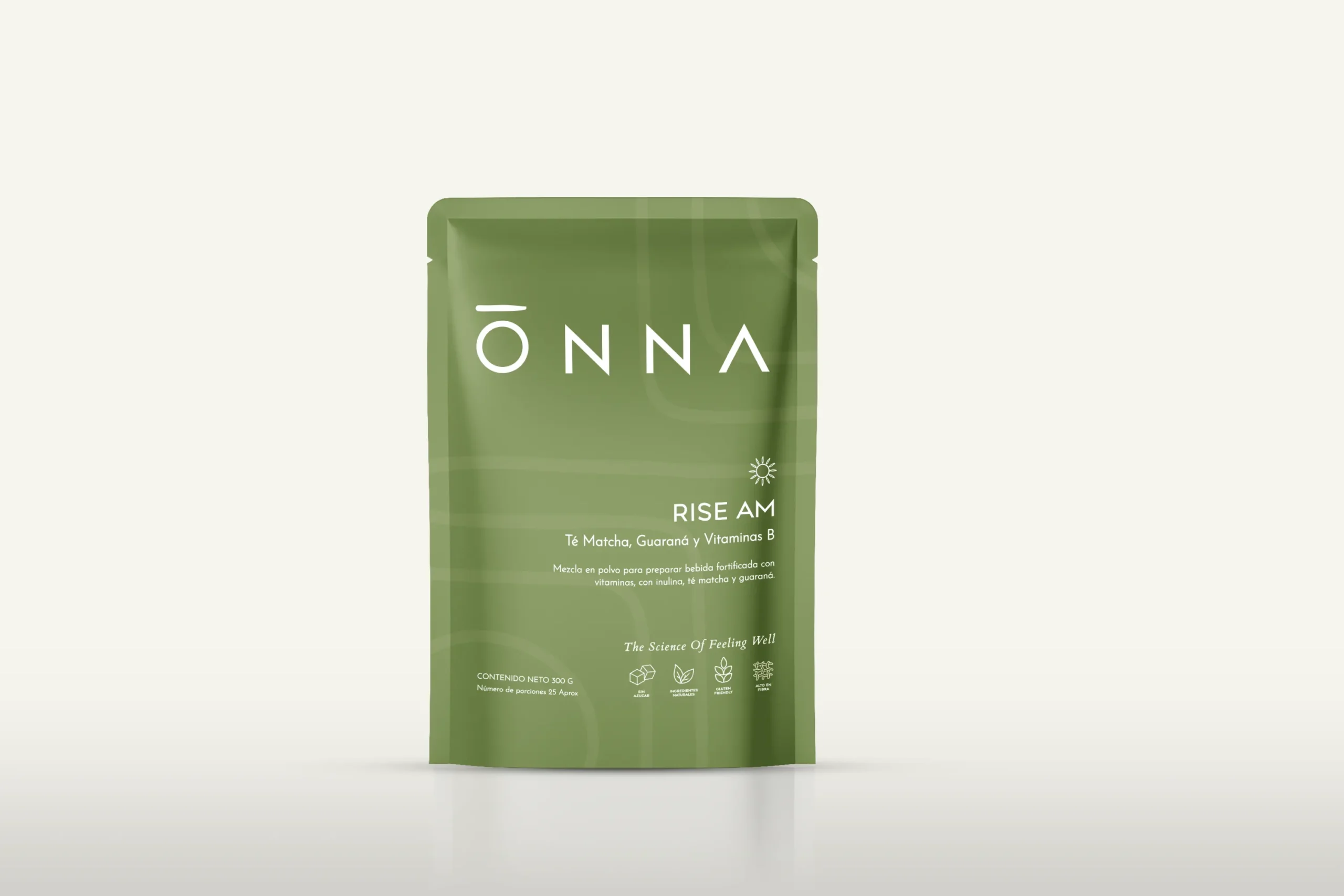
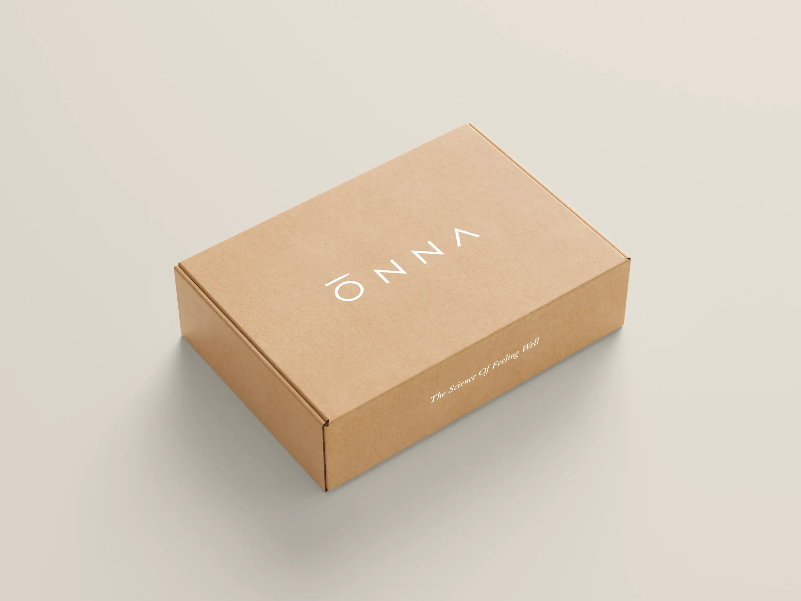
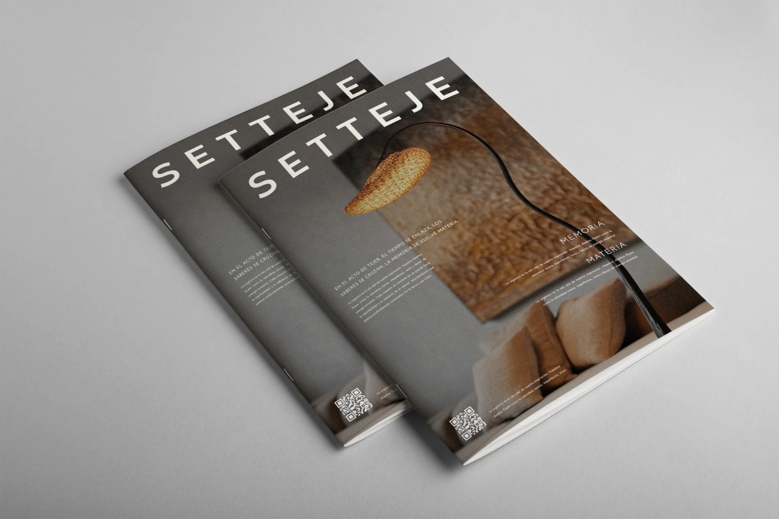
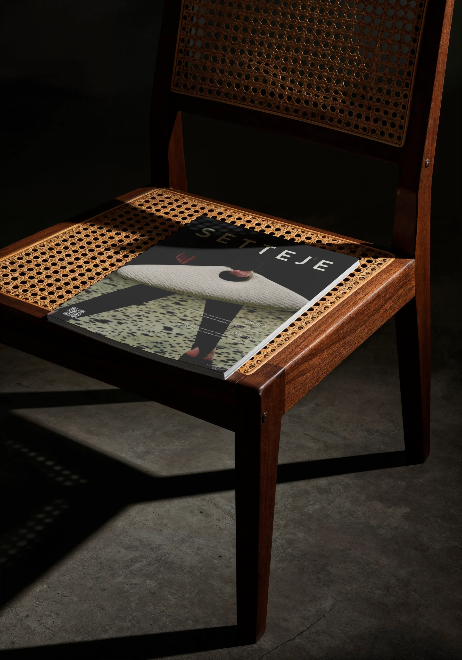
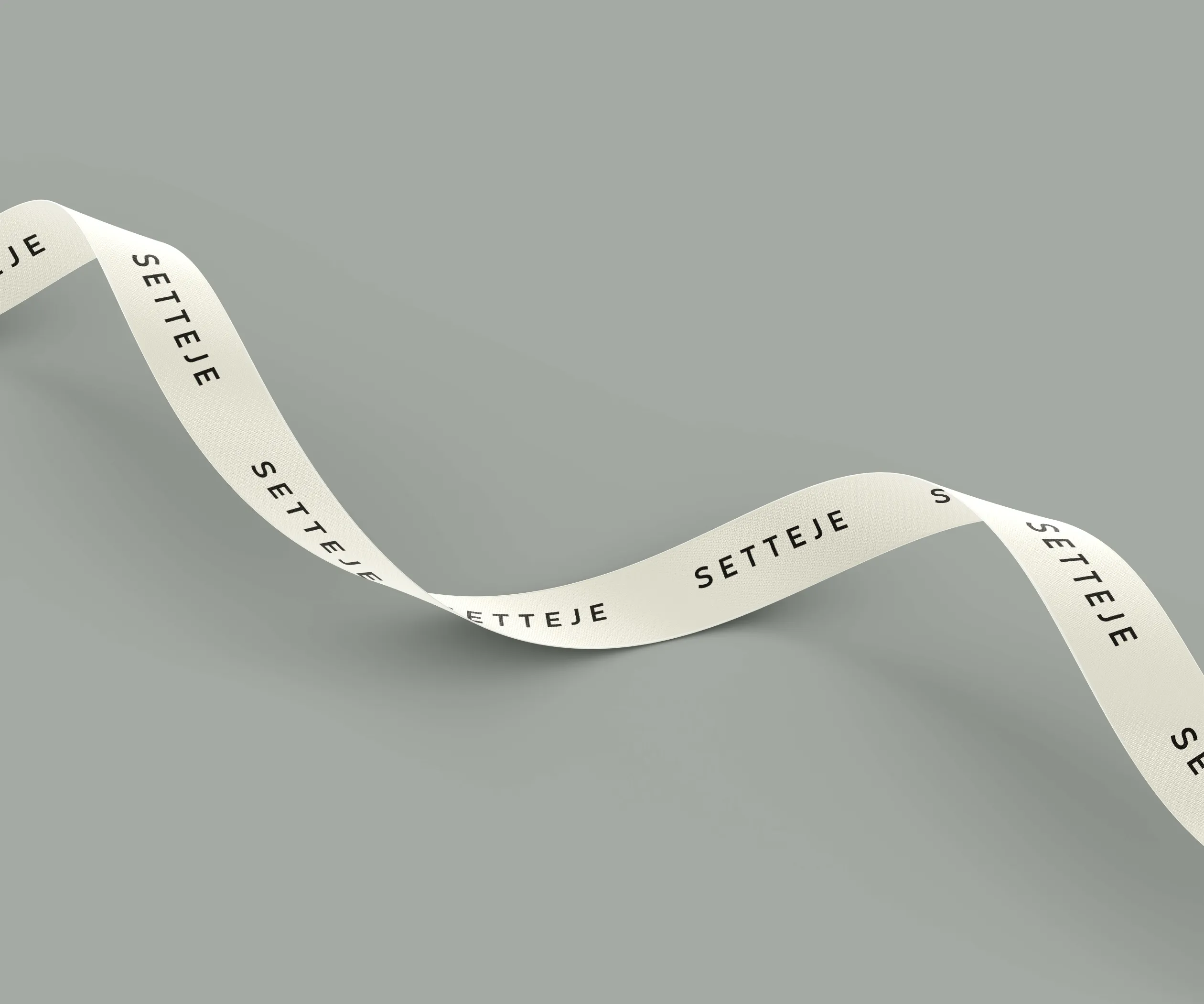
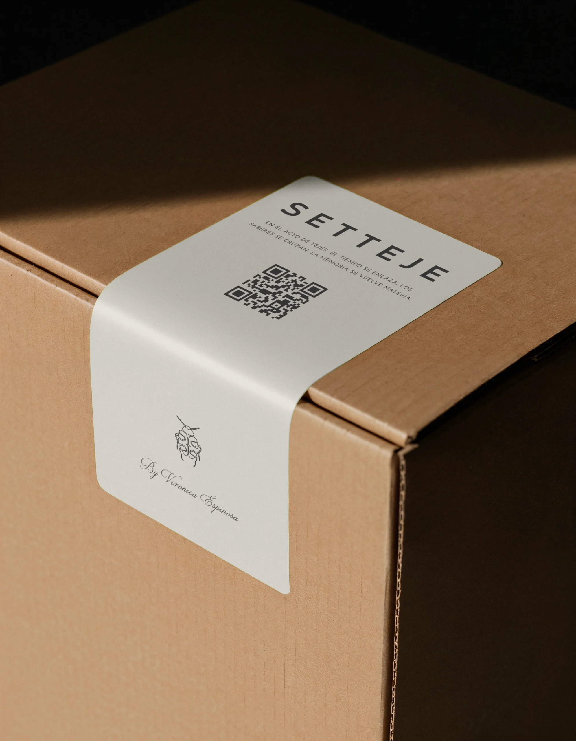
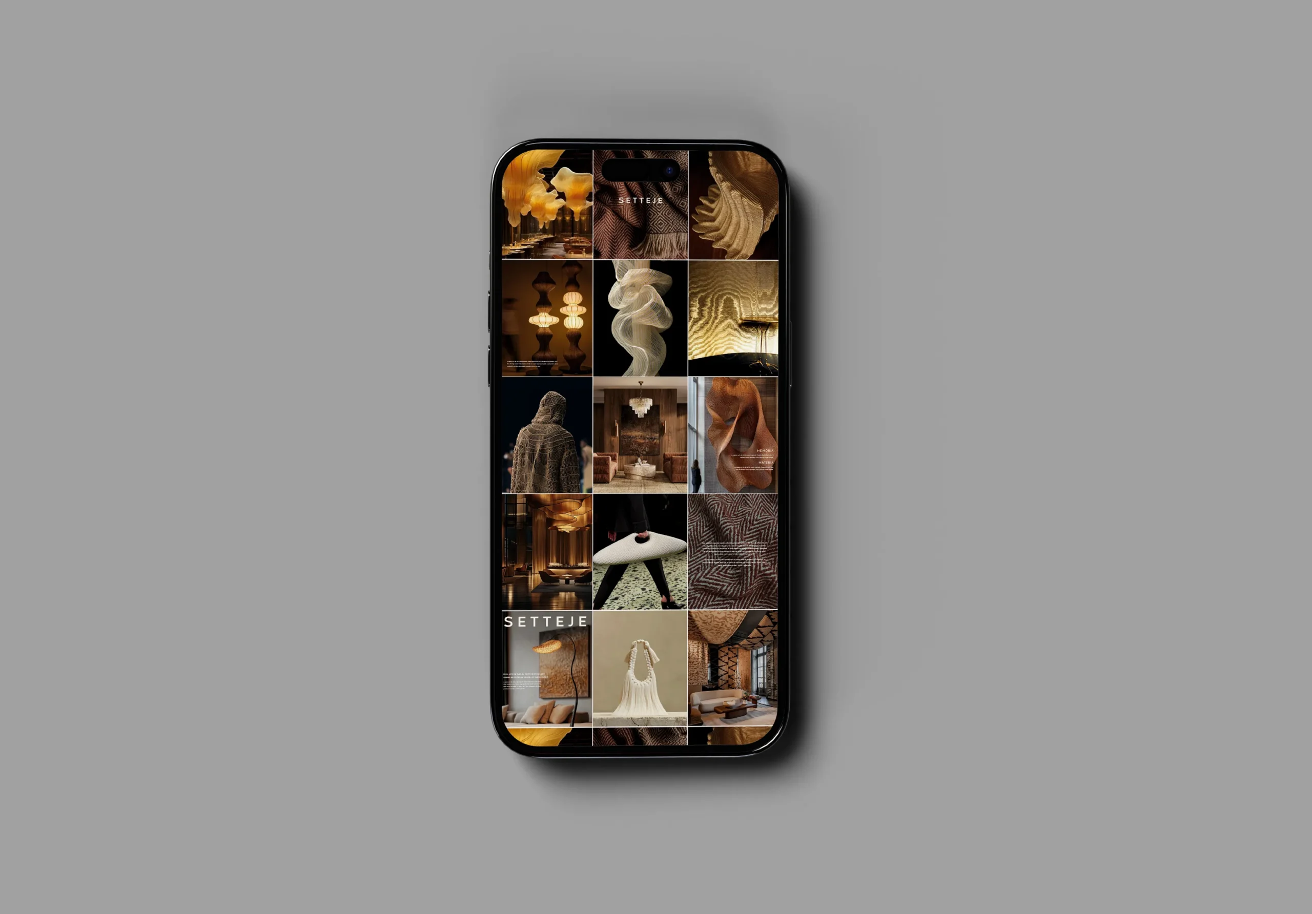
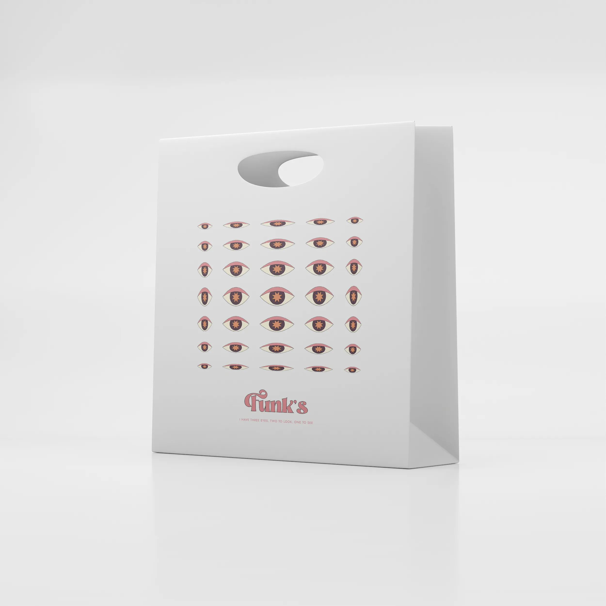
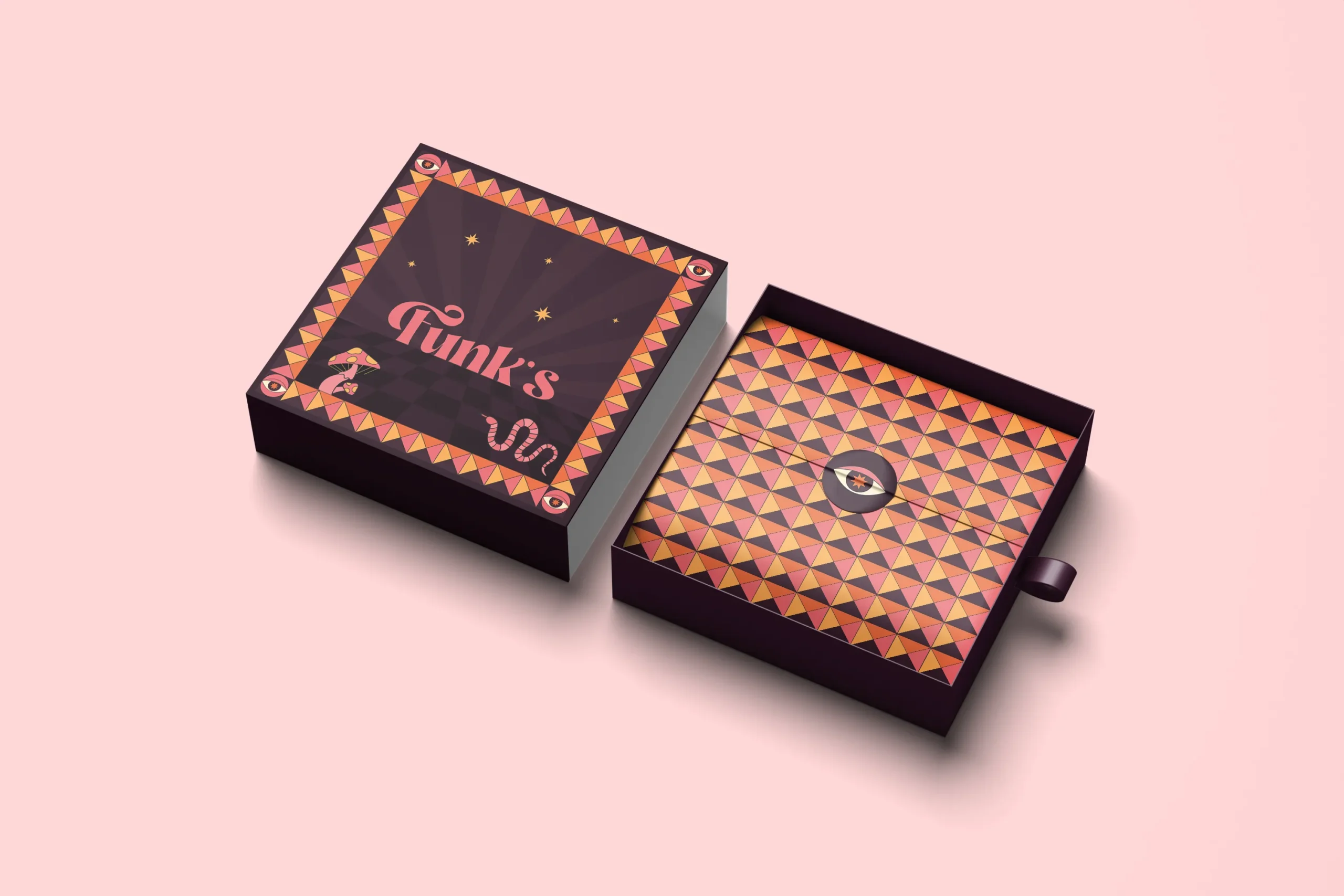
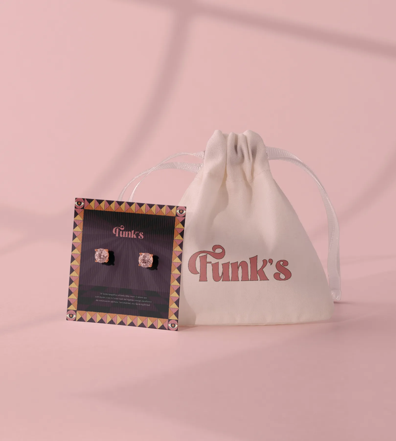
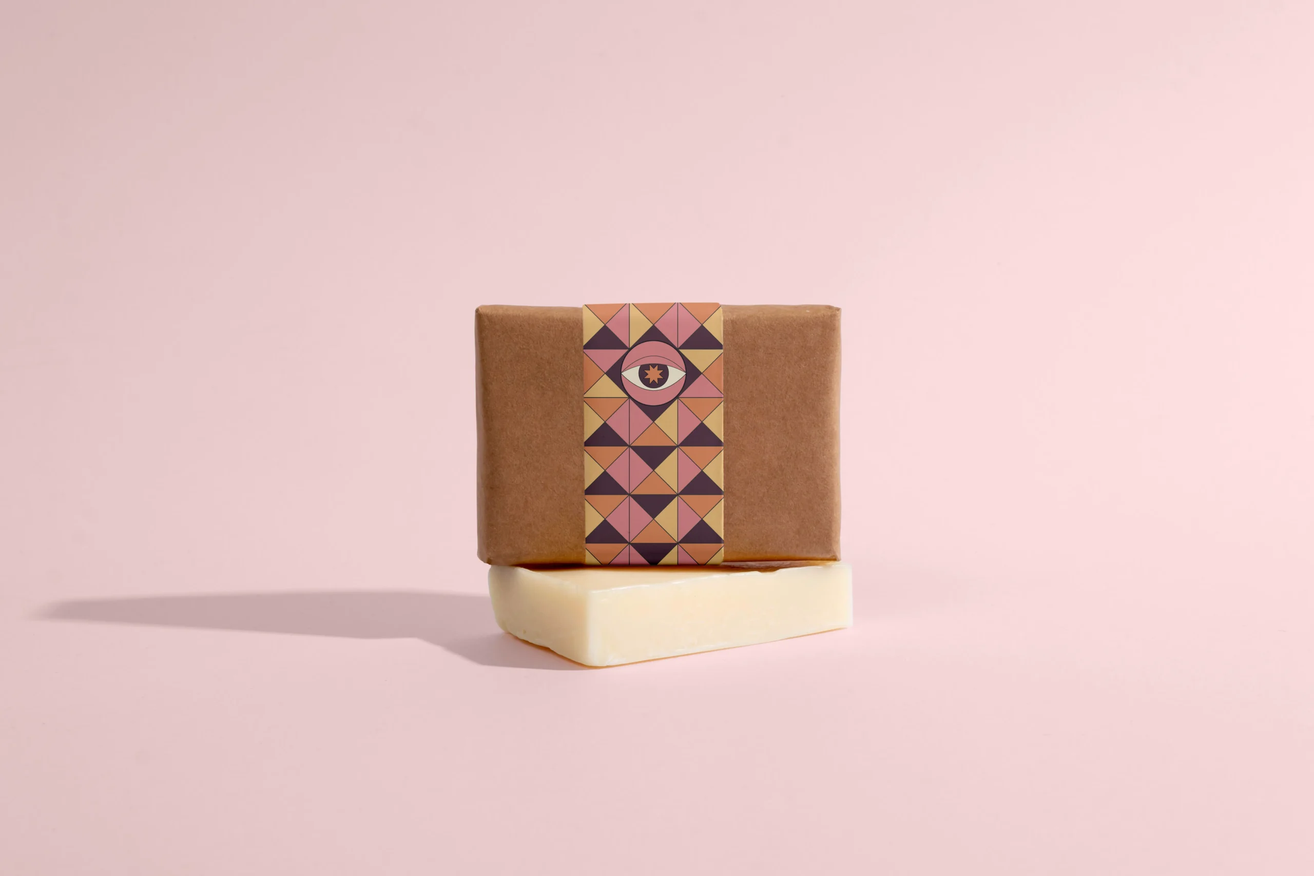
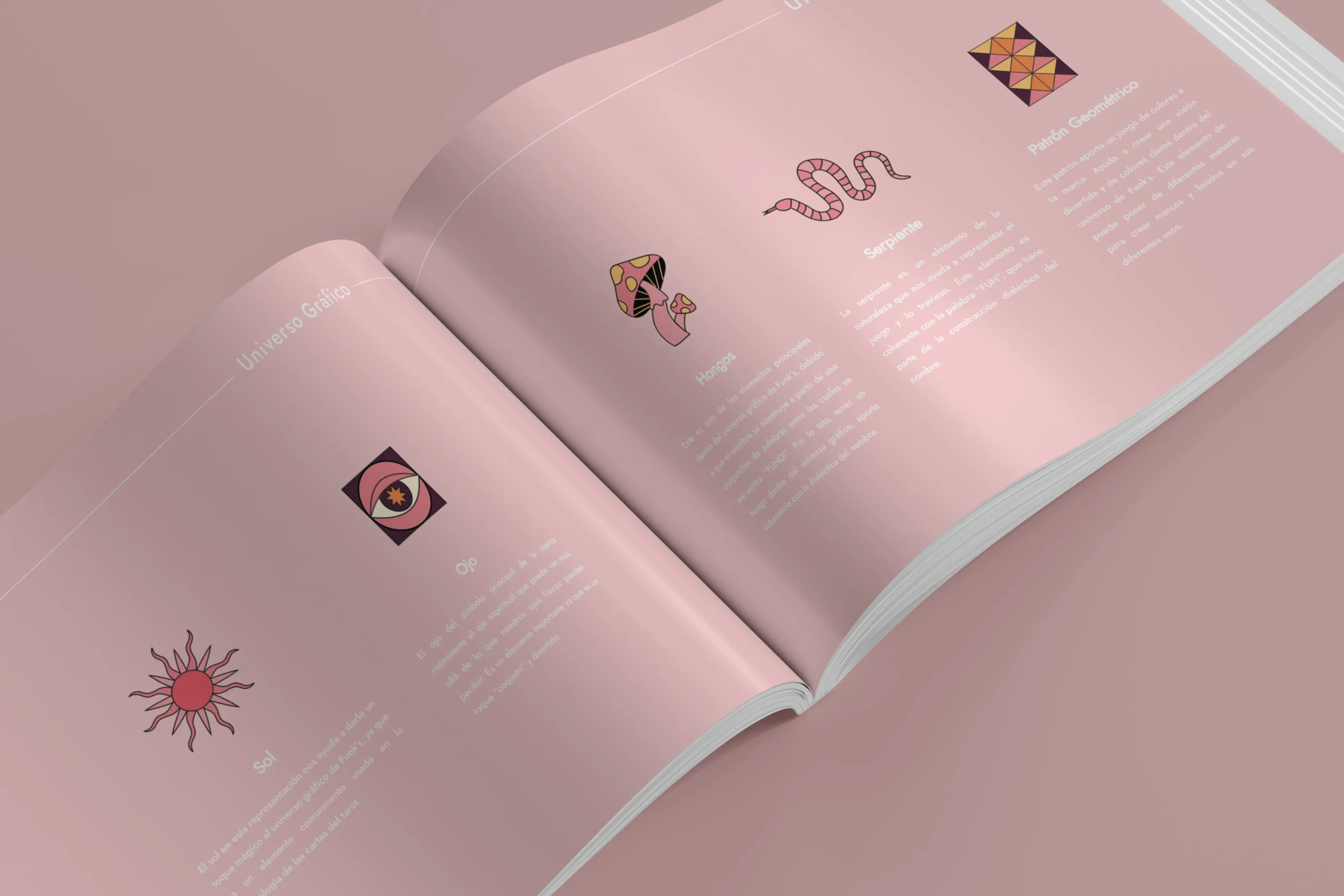
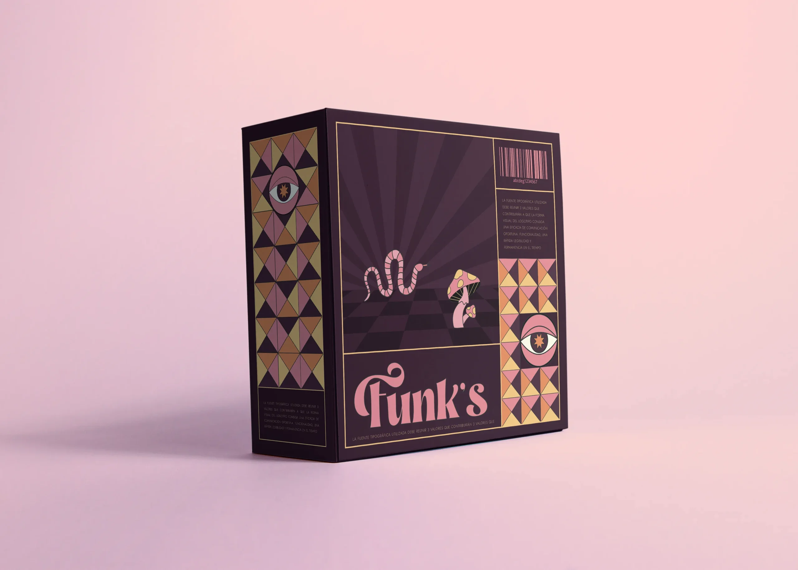
We build timeless, flexible identities tailored to fashion—clear strategy first, refined visuals second. From positioning and naming to full visual systems, we ensure every touchpoint feels consistent and premium.
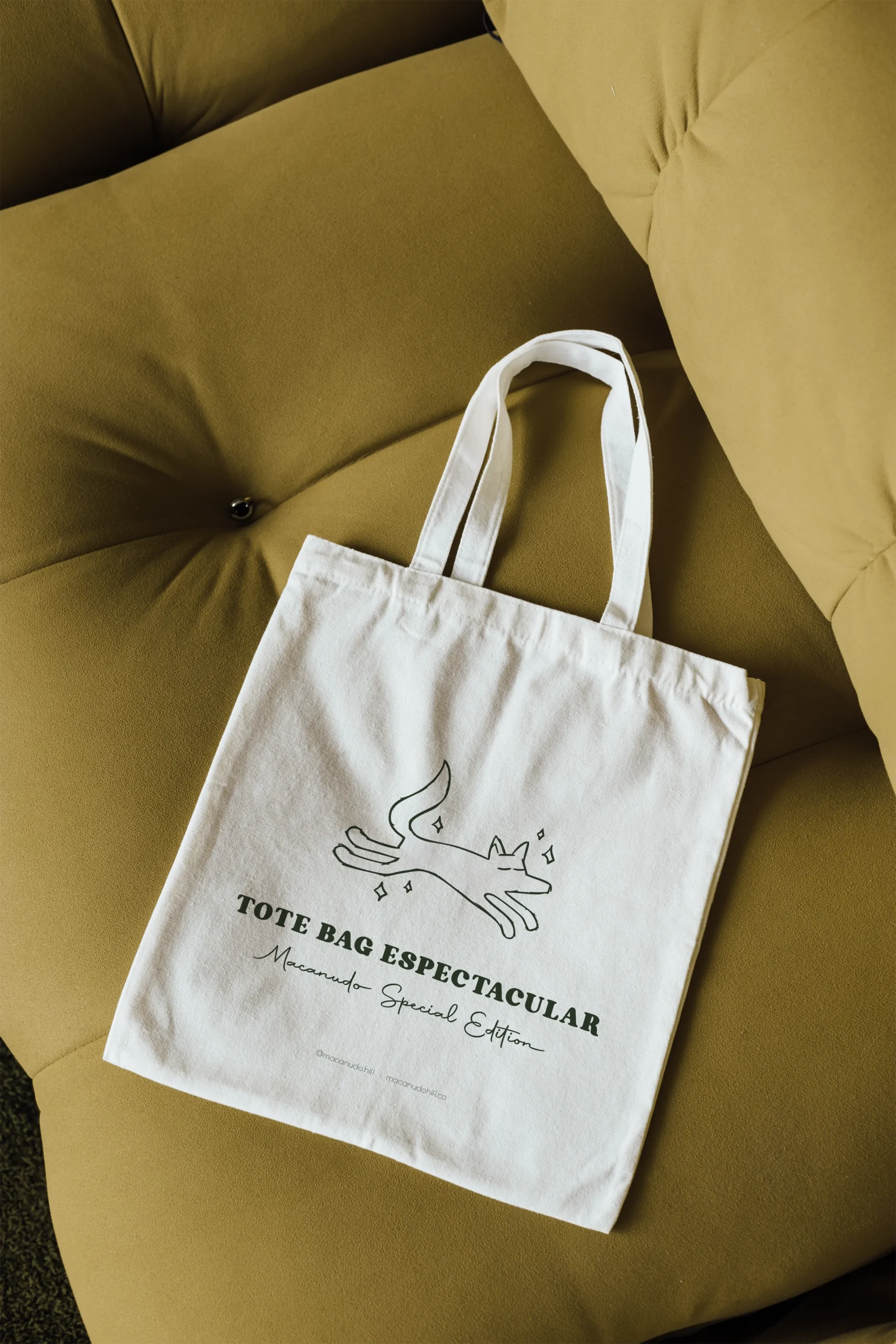
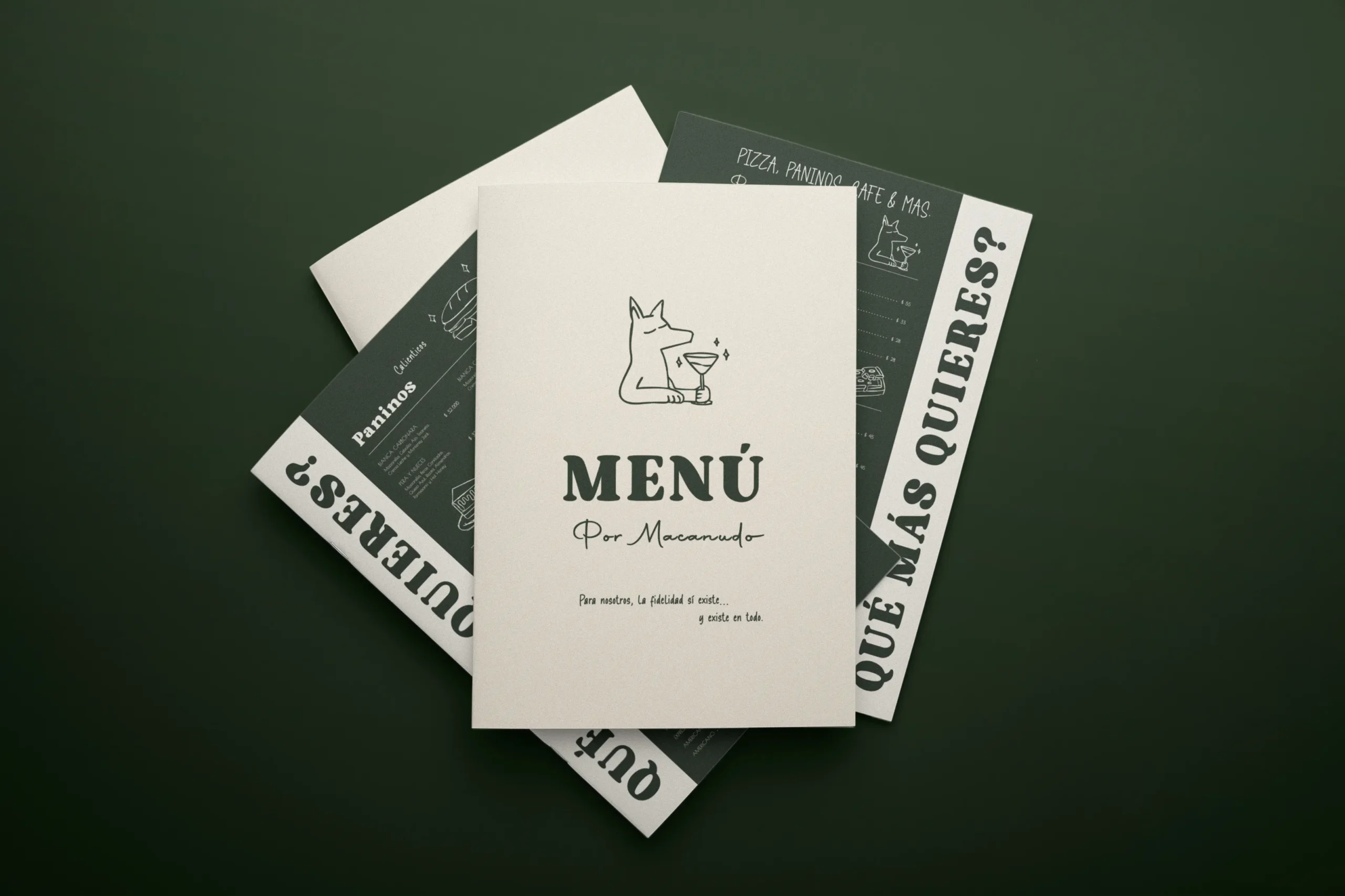
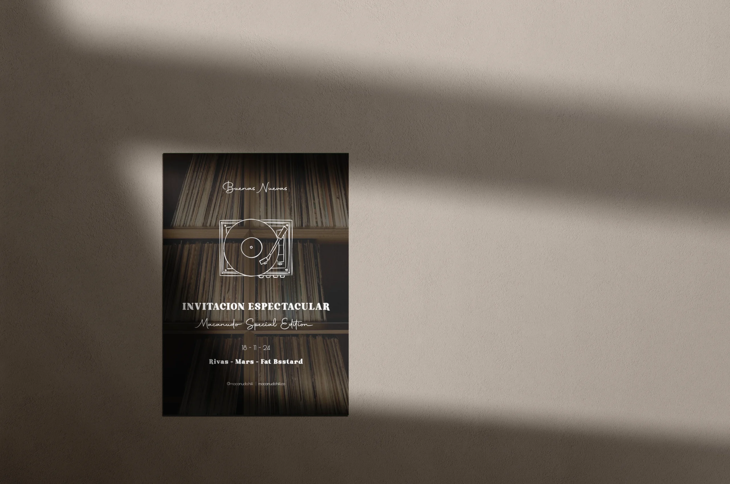
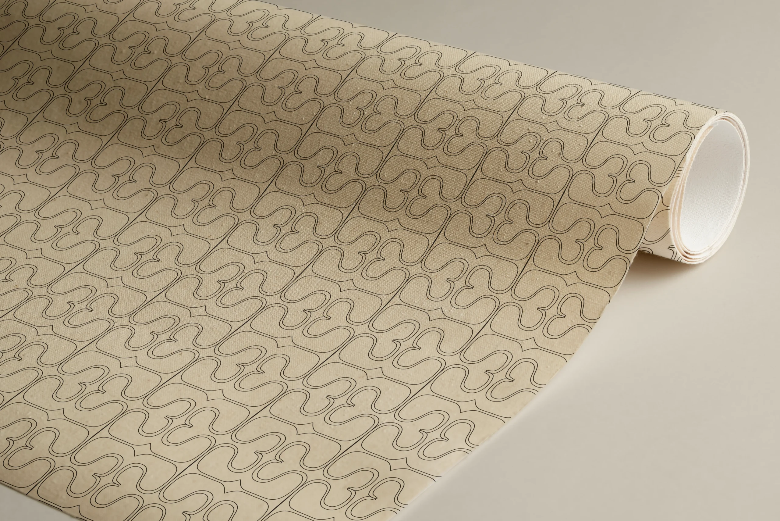
Includes: brand audit & positioning, naming support, logo suite (primary, secondary, marks), typography & color systems, imagery/art-direction guidelines, tone-of-voice basics, social & merchandising applications, and a production-ready brand book guidelines.
